Godfather
Monday, 29 November 2010
10. Conclusions
In order to be a successful design I added a picture of Vito Corleone with his hand pointing towards the viewer. The image was taken from the movie. I believe that standards have been met for a very good dvd label. I will remind that top picture was specifically modified in order to improve quality. Same with Michael and the 4 instances running through all stages of his life. From a simple son to be a true Don. Bottom logo symbolizes the authority that the DVD holds. The text that surrounds the bottom side of the DVD has the characteristics of a successful DVD. Finally, Corleone's quotes from at the bottom of his image symbolizes the power and spirit which characterized this film.
Sunday, 28 November 2010
9. Why did I change the picture ?
For the first part:
In order to get a good picture I had to work a while with image. The original image did not look like an image I could use. But using the clone tool I managed to get an exact replica so it covers every single inch of the disk image. Bu for a better quality I had to use more tools. That is why I used from the adjustment panel the levels, the selective color and the shadows/highlights tools.
For the second part:
I have decided that the first image I had was not good enough. After remaking the top picture I added an extra line to the hair to look more real so that the viewer has a realistic figure. After that I took every image and used the shadows/highlights tool to create a more brighter image and to reveal the true identity.
Saturday, 27 November 2010
8. The pictures details
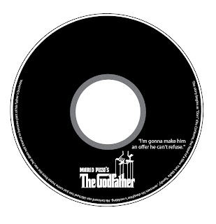
In order to get exactly the same standards as before, I decided to do the exact thing as I did for the DVD Cover. I used Illustrator to select the exact dimensions that I needed.


I added one extra line for the cutting machine, in case the cutting machine does not cut properly to have an extra space.
I wanted to use some quote from the movie because I gives an originality to the DVD. Also by using the the Godfather logo I reached a point of autonomy.
The las thing I did was to add some text to the bottom edge of the DVD. I think by doing this efect I have got the posibility to meet the quality standards.
Friday, 26 November 2010
7. Dimensions for DVD Label
The dimensions for my DVD Label are:
I have decided to use a background DVD taken from the internet to help me with the positioning and to have an idea how it is going to look.
This image was taken from: http://www.covergalaxy.com/XBox/Godfather+The+Game,+The/CD/
Thursday, 25 November 2010
6. Conclusions
After a period of several attempts I finally came to a final product. I am very pleased with the final product because it represents everything I wanted to show the picture on the DVD case.
It has everything a DVD cover should have. The main picture, main title, the casting, the logos, the awards, decription, the barcode and my blog.
I think that all my decisions that I've done have a meaning in the design of the final product.

The picture from the top right of the image was taken from:
http://connect.in.com/godfather-movie/photos-the-godfather-movie-image-8-beb97c06cb4932dc.htmlWednesday, 24 November 2010
5. Why did I change the main picture

For my main picture I’ve decided not to use an image from the web as this was my first plan because the quality of the picture was not very good. Instead I’ve decided to pick one image scene from the movie and make it as my main picture for side 1. Unfortunately I did not find that scene and so I’ve decided to make from 2 scenes one perfect image.
First of all, the 2 images were different sizes so I had to decrease the second image and select exactly the head. After I have done that I took the liberty to play with the clone and the brush tool to make everything to look perfect. For the last touch I wanted to change the background to black and to change the effect by using the Halftone Pattern from Filter menu. In the end I have reversed the position. All of these decisions were done because I thought they will improve my pictures quality.
The first image was taken from: http://wantedmovies.wordpress.com/2010/03/17/the-godfather-1972/
The first image was taken from: http://wantedmovies.wordpress.com/2010/03/17/the-godfather-1972/
Tuesday, 23 November 2010
4. All the DVD Logos
The most important thing about logos is that the give you autonomy, they give you a prototype. Today is very important.
I have chosen these logos because these are the one that fit perfectly with my movie and the idea of a DVD COVER.
I chose DVD VIDEO because it is important and it describes the quality of the movie.
I chose DOLBY DIGITAL because is important and it shows the audio quality
I chose PARAMOUNT because is it important to know the film production how done the film.
The last thing I want to talk about is the Barcode. I chose to use barcodes because it helps me to label my product if a person wants to buy it.
The images I used were taken from the following links:
http://robertmoseley.netfirms.com/video.htmlhttp://logotypes.designer.am/srch/search.php?pg=12&r=t&a=d
http://www.emulsioncompulsion.com/gallery2/v/LOGOS/Paramount+logo.jpg.html
http://freebarcodefonts.dobsonsw.com/
Monday, 22 November 2010
3.The Logo of the Godfather
The Godfather logo is one of the most important pieces of Corleone lifetime. It represents a unique style and elegance because it expresses so much. I have used it to illustrate the power of visual expression. Quite simply by observation we can infer what's already been expressed. He meets a cruel world, but expresses the force that Don Corleone holds. Like a puppeteer, he leads his puppets through his power. And so the Godfather lead lives of people through the power and respect he acquired throughout the years. A replica we can also find in the film discussion between Vito and Michael Corleone, when the father tells his son "I Refused to be the fool, dancing on the strings held by thos bigshots." What it means is that Vito refused his life to be led by some big boss and he made his own way through life. That’s the respect he earned in his life.
(Image from the movie The Godfather)
(Image from the movie The Godfather)
Sunday, 21 November 2010
2. Why I used the font?
For my DVD cover I used 2 fonts. Both are on side 2. The top one for the description is Myriad Pro and the second one for casting is Haettenschweiler. I used them because it fits perfectly to my standards. Font Size is 8, Justify Last Left Align for the first one and Font 14 and Left Align Text for the second one.
I was missing some text for my DVD case.
The best way to look for it was online. website www.dafont.com to find the appropriate font. The font is called “Corleone”. I used it for "Part 1" and my blogs name “http://worldisadesign.blogspot.com”.
Saturday, 20 November 2010
1. Introduction + Dimensions
This is my first blog and I'll explain everything I will do to the Digital Imaging Software module. This will be my logbook. Here I will discuss technical details of what lies in editing. I have to design a DVD cover; a DVD/CD on-disk label and 1 minute PRMOTIONAL VIDEO. I will use three Adobe software package. They are: Photoshop, Illustrator and Premier Pro.
I will aproach in my project a movie which garnered ten Academy Award nominations and was named Best Picture, The Godfather.
I choose this film because is one of Hollywood's greatest critical and commercial successes. The Godfather gets everything right; not only did the movie transcend expectations; it established new benchmarks for American cinema.
First of all I'll start with the DVD cover:
Dimensions with which I will work are:
I used Illustrator because I have some knowledge with it, to create the exact dimensions I will need for my DVD cover.
I used Illustrator because I have some knowledge with it, to create the exact dimensions I will need for my DVD cover.
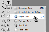
I used the Rectangle Tool because it gives you the possibility to use the exact size. In my case, I used 272 mm width and 184 mm height.
I needed a dashed line to arrange the edges so I used Dashed Lines 1.1 in Illustrator to obtain the desired effect.
Subscribe to:
Posts (Atom)


