This is a page with my Personal Development Plan.
World Is A Design
Godfather
Friday, 10 December 2010
Friday, 3 December 2010
13. Final Conclusion
Because the Promotional Video had to be only 1 minute, I had to cut quarters from the clips, because my original length was 3 minutes. I had some problems with the audio as well, because the movie's audio was forward and I had to move it 2 seconds to the left side.
As a conclusion I can say that from all of the editing I have done for the past 3 months, I learned a lot and I hope that with these knowledge I will be able to develop many more projects like this.
Thursday, 2 December 2010
12. The clarity of the video I used
A DVD has only 4.7 Gb free space.
My movie format was Full HD, 1080p, but because I could not use a MKV format for my editing like in the right picture I had to change my movie format to an AV
change my movie format to an AVI, 240p, like in the left picture. That is why my promotional video will not have a HD quality format and the image will by more pixaleted.
Wednesday, 1 December 2010
11. Promotional Video Details
Monday, 29 November 2010
10. Conclusions
In order to be a successful design I added a picture of Vito Corleone with his hand pointing towards the viewer. The image was taken from the movie. I believe that standards have been met for a very good dvd label. I will remind that top picture was specifically modified in order to improve quality. Same with Michael and the 4 instances running through all stages of his life. From a simple son to be a true Don. Bottom logo symbolizes the authority that the DVD holds. The text that surrounds the bottom side of the DVD has the characteristics of a successful DVD. Finally, Corleone's quotes from at the bottom of his image symbolizes the power and spirit which characterized this film.
Sunday, 28 November 2010
9. Why did I change the picture ?
For the first part:
In order to get a good picture I had to work a while with image. The original image did not look like an image I could use. But using the clone tool I managed to get an exact replica so it covers every single inch of the disk image. Bu for a better quality I had to use more tools. That is why I used from the adjustment panel the levels, the selective color and the shadows/highlights tools.
For the second part:
I have decided that the first image I had was not good enough. After remaking the top picture I added an extra line to the hair to look more real so that the viewer has a realistic figure. After that I took every image and used the shadows/highlights tool to create a more brighter image and to reveal the true identity.
Saturday, 27 November 2010
8. The pictures details
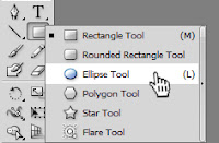
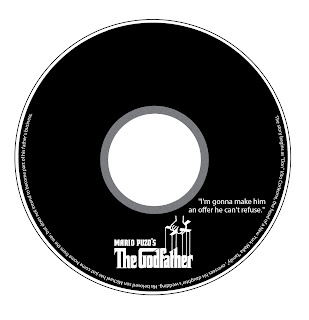
In order to get exactly the same standards as before, I decided to do the exact thing as I did for the DVD Cover. I used Illustrator to select the exact dimensions that I needed.


I added one extra line for the cutting machine, in case the cutting machine does not cut properly to have an extra space.
I wanted to use some quote from the movie because I gives an originality to the DVD. Also by using the the Godfather logo I reached a point of autonomy.
The las thing I did was to add some text to the bottom edge of the DVD. I think by doing this efect I have got the posibility to meet the quality standards.
Subscribe to:
Comments (Atom)


